ShopDreamUp AI ArtDreamUp
Deviation Actions

Type design is all about balancing the black versus white to create a consistent texture. One of the—perhaps more obscure—principles of creating well balanced type is a consistent stroke weight in certain areas—particularly in the joins. This is true even for simple geometric typefaces of which you probably wouldn't expect it if you're not familiar with dark spots.
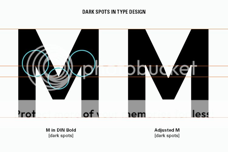
Dark spots occur in places where two strokes meet and this is particularly true when two strokes meet at a sharp angle. When two strokes meet there is a weight build-up which should be optically adjusted. The letter 'M' for example usually has three dark spots, one for each bend. Adding so-called ink traps [picture below] can get rid of these dark spots but it's quite an obtrusive method. essentially you add an extra vector point in the narrow negative space area and simply widen the area to give the black room to "breathe".
Ink traps are mainly reserved for two things:
 To avoid the flow of ink into narrow negative spaces when using fast and cheap printing techniques such as newspaper printing.
Nowadays ink traps are often added as a style; a sort of decorative element.
If you want to add ink traps to your typeface for functional reasons rather than aesthetics you have to consider at what point size your typeface will be used. For display typefaces you would probably add relatively small ink traps compared to text typefaces as the flow of ink in smaller type is much more disruptive than it is for big type.
It should also be noted that not all typefaces require dark spots to be avoided/removed. In case of DIN for example these dark spots are actually part of the typeface's aesthetic. In case of a typeface like Futura however the weight of the strokes need to be consistent so it's good to avoid dark spots in this case. Besides, it's fine if you want your typeface to feature dark spots but it obviously should be a conscious choice and shouldn't occur due to ignorance.
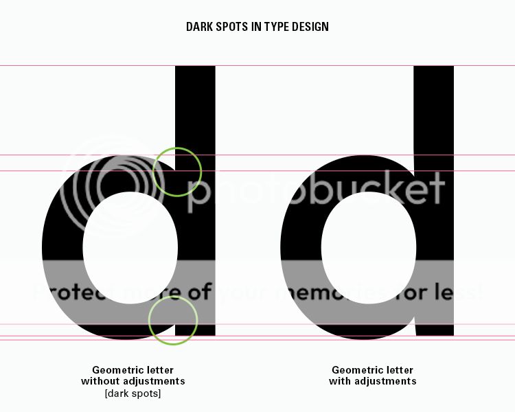
So how should dark spots be avoided without using ink traps? The principle doesn't differ much from ink traps. Instead of widening the narrow negative space you make it longer. You will often have to add a few extra vector points so you can make the negative area go inwards into the letter a tiny bit besides elongating it. Look at the image below to see the difference and particularly note the vector points in regard to the guidelines.
And that's it really! I assure you that by avoiding these dark spots when appropriate will improve your typefaces instantly. It will make the texture of your typeface more consistent and in effect will improve the reading experience.
Written by MartinSilvertant.
Ink traps
Dark spots occur in places where two strokes meet and this is particularly true when two strokes meet at a sharp angle. When two strokes meet there is a weight build-up which should be optically adjusted. The letter 'M' for example usually has three dark spots, one for each bend. Adding so-called ink traps [picture below] can get rid of these dark spots but it's quite an obtrusive method. essentially you add an extra vector point in the narrow negative space area and simply widen the area to give the black room to "breathe".
Ink traps are mainly reserved for two things:
If you want to add ink traps to your typeface for functional reasons rather than aesthetics you have to consider at what point size your typeface will be used. For display typefaces you would probably add relatively small ink traps compared to text typefaces as the flow of ink in smaller type is much more disruptive than it is for big type.
It should also be noted that not all typefaces require dark spots to be avoided/removed. In case of DIN for example these dark spots are actually part of the typeface's aesthetic. In case of a typeface like Futura however the weight of the strokes need to be consistent so it's good to avoid dark spots in this case. Besides, it's fine if you want your typeface to feature dark spots but it obviously should be a conscious choice and shouldn't occur due to ignorance.
Removing dark spots
So how should dark spots be avoided without using ink traps? The principle doesn't differ much from ink traps. Instead of widening the narrow negative space you make it longer. You will often have to add a few extra vector points so you can make the negative area go inwards into the letter a tiny bit besides elongating it. Look at the image below to see the difference and particularly note the vector points in regard to the guidelines.
And that's it really! I assure you that by avoiding these dark spots when appropriate will improve your typefaces instantly. It will make the texture of your typeface more consistent and in effect will improve the reading experience.
Written by MartinSilvertant.

Numeral sets
TYPOGRAPHY SERIES:
01 – Anatomy of typography
02 – Ligatures
03 – Numeral sets
A lot of people may think that numbers are just numbers but within typography certainly not all numbers are alike. As the Latin alphabet consists of both uppercase and lowercase letters, we also have numeral sets to go with both and we have a few other sets with different functions. Part 3 in the typography series is about the different numeral sets and their functions within typography.
Click on the image below to go to the deviation page so you can comment and/or add it to your favorites and download a zip file including a 2000px wide .jpg and
Ligatures
TYPOGRAPHY SERIES:
01 – Anatomy of typography
02 – Ligatures
03 – Numeral sets
In the 90's digital typography was very basic but as the technology progressed the typography became increasingly sophisticated. Nowadays it's even possible to use ligatures through OpenType. In this tutorial you will learn about the three types of ligatures and what they're useful for.
Click on the image below to go to the deviation page so you can comment and/or add it to your favorites and download a zip file including a 2000px wide .jpg and an .ai vector file:
Anatomy of typography
TYPOGRAPHY SERIES:
01 – Anatomy of typography
02 – Ligatures
03 – Numeral sets
There have been many images going around the Internet explaining the basic elements of typography but most of these sources are incredibly basic and incomplete. That's why I decided to come up with my own version and be as complete as possible.
I excluded several things like diacritics, the different ligature types, numeral sets etc. to avoid making it look too chaotic but most of the basic elements seem to be there. I will focus on diacritics, ligatures and numeral sets later in this ongoing typography series.
Click on the image below to go to
R and S - Font Gallery Update!
pica-ae (https://www.deviantart.com/pica-ae) and I (MartinSilvertant (https://www.deviantart.com/martinsilvertant)) have been working hard to come up with a proper font categorization system on DA and with the help of moonbeam13 (https://www.deviantart.com/moonbeam13) it's finally live! I would also like to mention brianskywalker (https://www.deviantart.com/brianskywalker) here for helping me name and define the categories in a manner which would be understandable not only to professional type designers and historians but to the common folk on deviantART as well.
To read all about this major update (and a big step forward for the DA typography community) check the Community Relations Journal update of Jun 25, 2012.
And for those who have been waiting for the articles about each typefa
Featured in Groups
© 2012 - 2024 Temple-of-Typefaces
Comments1
Join the community to add your comment. Already a deviant? Log In
Brilliant tip!